This year I stopped using stock photos in my blog posts, and I think you should too. Why? Because they all look the same. How many times have you seen certain photos from Unsplash or Death to Stock be used?

Good writers try to invoke a certain feeling with stock photos, like a sense of adventure, challenge, sadness, etc. But many times, the same or similar photos end up being recycled through the blog-o-sphere.
What you need is something unique. Something that stands out and catches the eye of the reader before they even dive into the text.
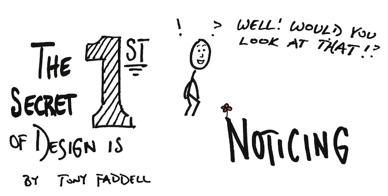
Something like sketchnotes!
Yes, I’m biased, but I’m not the only one who has caught on to this idea. Most of the clients I work with ask me to create blog sketchnotes for their popular posts, because of how it separates from the noise online.
Tim Urban, who runs the massively popular Wait but Why blog, has been creating simple illustrations and sketches on his posts for years.
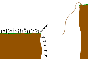
On Videofruit, Bryan Harris has also been using a similar method to make ideas come to life without stock photos.
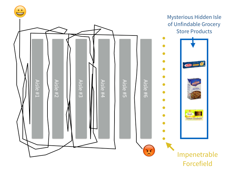
James Clear, who writes about psychology and habit formation at JamesClear.com, has been creating hand-drawn graphs and charts on his posts for over a year.

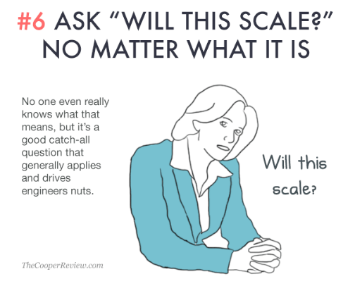
Sarah Cooper started The Cooper Review and wrote the massively successful post (now book) 100 Ways to Appear Smart During Meetings, mostly using hand-drawn illustrations.
The secret all of these professional bloggers share
None of them are trained artists. You can tell that from the sketches. They’re not complicated, but you know right away what’s happening in the scene. The sketches are not trying to invoke a feeling, they go directly to what’s happening.
What you can do
Creating these illustrations and sketches only requires the understanding of a few basic elements of drawing and tools that you already have available.
Simple shapes
This was one of the first lessons I learned from Mike Rohde and Dan Roam’s books. All you need to begin are a few simple shapes.
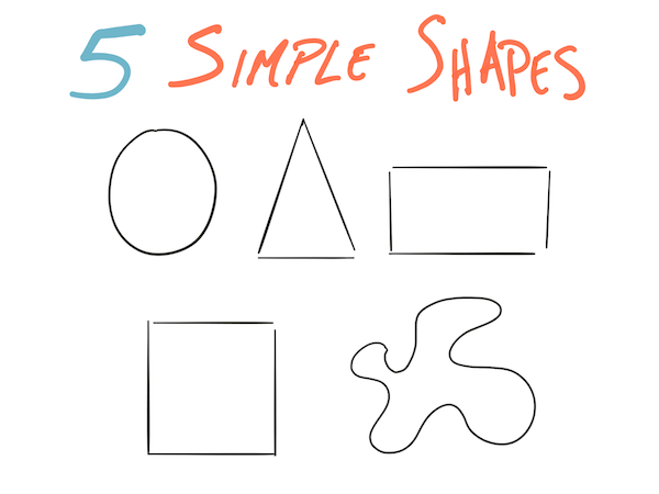
With these shapes, you can create many different types of sketchnotes. Here’s a quick example:

I know you may not want to create an outdoor family scene, but see how you can communicate an idea with a few simple shapes?
Here’s a different example. In a recent post on time tracking, I sketched out my bar graph instead of making one in Excel. I’ve never had people comment on how a bar graph looked before, and it’s because the sketch style stands out!
![]()
The only 2 (or 3) tools you need to begin
There are really only two tools you need to begin creating sketchnotes for your blog.
A piece of paper and a pen. Everything else can be used later.
It can be a Bic ballpoint and printer paper, just keep it simple and see what you can create.
To be specific though, here’s what I recommend as your first sketchnote toolkit.
- Pen: Pentel EnerGel 0.7
- Paper: Blank 5×8 index cards
If you have a smartphone, then download the Scannable app from Evernote. It captures color well for an app, saves to Evernote, and you can export to your camera roll for easy uploading to your blog!
My not-so-secret iPad app for sketchnotes
I do most of my “official” sketchnotes on the iPad now, and the app I use the most is Paper by FiftyThree. You can use it on the iPhone too, I just find the screen size challenging.
Even if you don’t have an Apple Pencil to use, or FiftyThree’s stylus, you can create basic sketches, graphs, and more just using your finger! In my opinion, it’s also the best ink and color experience on a drawing app.
Want to learn more?
I created a 5-day email course that dives deeper into the basics of creating sketchnotes, would you like to receive them? I cover everything in this post with more detail, and more lessons to help you get started. Just sign up below!

Leave a Reply